
Fintech design system
Building the v1 design system and beyond!
Developing a design system requires careful consideration of consistency, scalability, and usability across products and teams. It must balance brand expression with functional flexibility, ensuring components are accessible, well-documented, and easy to adopt. Successful design systems also account for cross-team collaboration, governance, and ongoing maintenance, enabling the system to evolve alongside product and business needs.
Each step of the way I also have to manage initial buy-in, stakeholder management and all the storytelling needed for a smooth transition. Understanding all of its uses is essential.
Project overview / context
Shawbrook already had a number of products in flight but had a distinct lack of consistency. In order to address the issue of consistency and easily being able to update products, it was decided to implement a design system. By implementing a design system we can begin to align all internal and external products so that everything 'looks and feels' like Shawbrook. Having a strong identity helps build trust and confidence which is especially needed in a financial institution.
A design system provides a shared foundation that promotes consistency, efficiency, and quality across digital products. By standardising components, patterns, and guidelines, it reduces duplication of effort and accelerates design and development workflows. Design systems improve collaboration between teams, ensure a cohesive brand experience, and support accessibility and usability at scale. Over time, they also simplify maintenance and enable products to evolve more easily while remaining aligned with organisational standards.
Starting from an audit and seeing what consistencies exist already helps build out a baseline.
Research
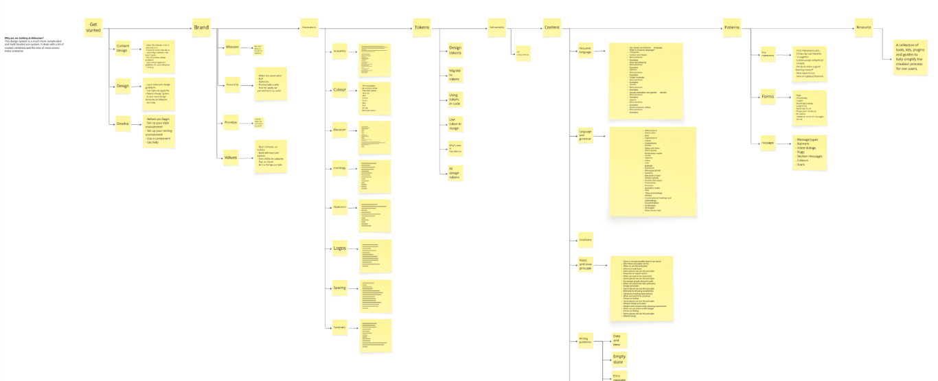
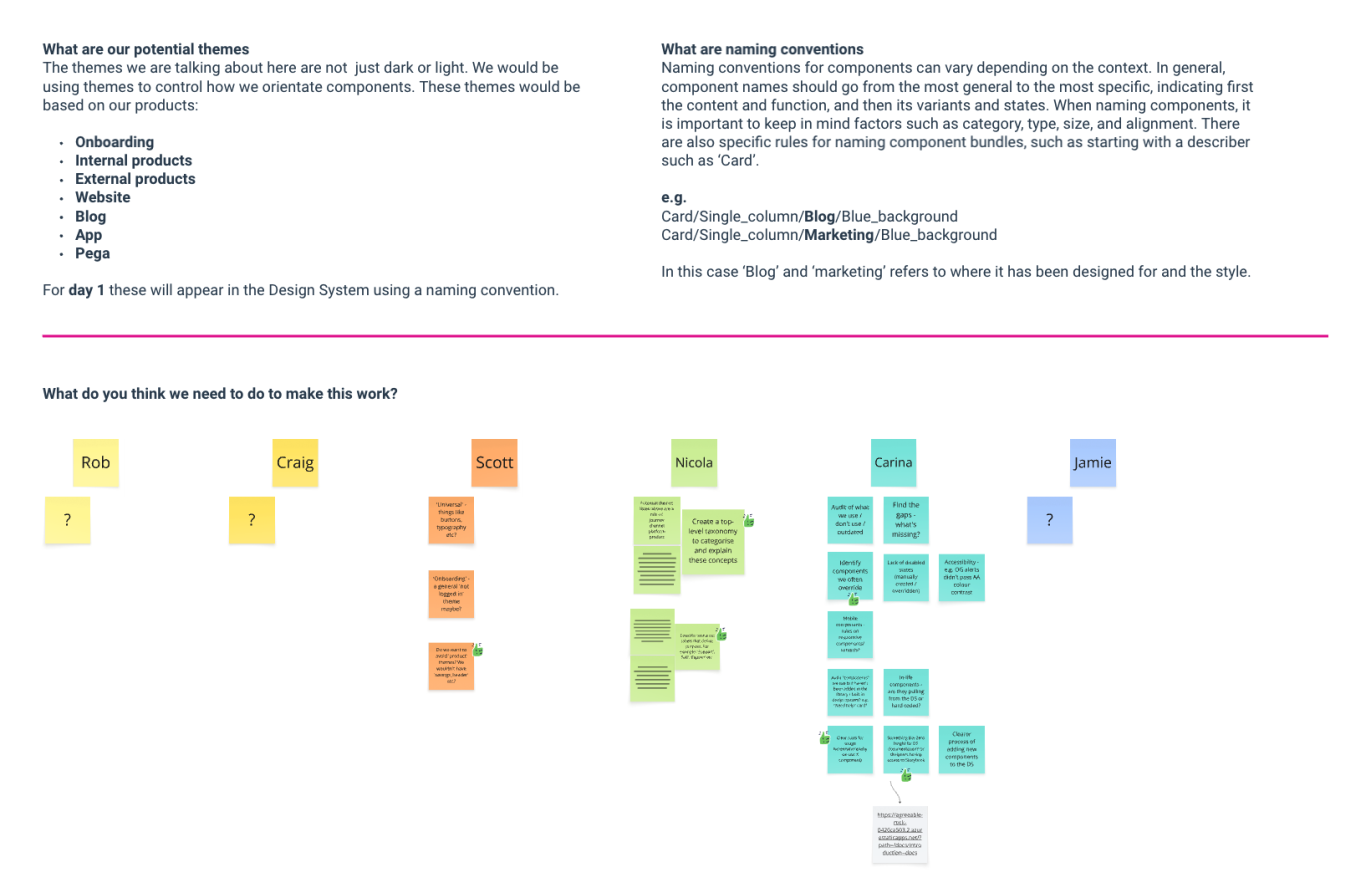
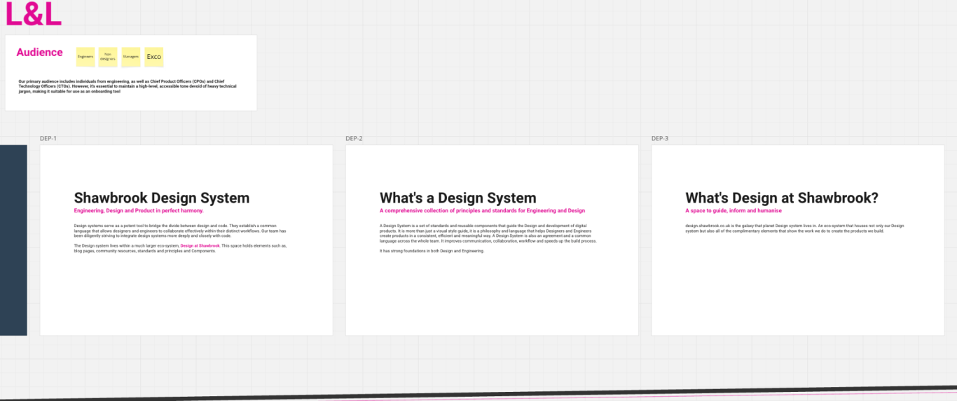
How will we actually use it? A design system is a pretty standard tool that you could just download if you needed too, the difference between a good design system and a great one is how its tailored to what you need to do with it. Getting more opinion and use cases helped me build out more personae to help shape not only the system but also what the homne of the design system looks like. The SDS will need to have somehwere to live and be easy to distribute to third parties.
It also exposed things like how we use themes to control our components and structure our Design System around specific attributes. This will allow others to properly use the components in the right context.
Key focus areas
I've built a number of design systems in my career and each one has different subtle needs beyond just components that need to be catered for. This includes content design to help maintain the correct tone of voice and more critically:
Consistency at scale
Ensures a cohesive look, feel, and behaviour across all products and touch-points.
Efficiency and speed
Reusable components and patterns reduce design and development time and eliminate duplicated work.
Improved collaboration
Creates a shared language between designers, developers, and product teams, reducing misalignment.
Higher quality and usability
Components are tested, refined, and accessible by default, leading to better user experiences.
Scalability and flexibility
Makes it easier to build, expand, and maintain products as teams and product portfolios grow.
Stronger brand alignment
Reinforces brand standards while allowing teams to innovate within clear guidelines.
Simplified maintenance
Updates can be made centrally and rolled out consistently, reducing technical and design debt.
My role
My main roles for the development of the design system started by trying to understand the question - What is the best way to unify Shawbrook's product catalogue and create a smooth way of creating a visual language that is easily recognisable as Shawbrook. My other key roles were:
Design System Lead / Product Owner
I set the vision, defines principles, and ensured alignment across teams. I was also responsible for direction, prioritisation, and determining the long-term health of the system.
Product Designer
I designed the components, patterns, and layouts while ensuring usability, accessibility, and consistency. I also ensured the system reflected brand guidelines, visual identity, and design principles.
UX / Research
Validating components and patterns through user needs, accessibility requirements, and usability testing.
Accessibility
Ensuring components meet accessibility standards (e.g. WCAG) and work for all users to a minimum of AA compliance.
Product / Stakeholder Representative
Aligning the system with business goals, product needs, and adoption across teams. A great deal of storytelling took place to make sure there were no surprises.
Governance & Maintenance
Managing contribution models, reviews changes, documentation, and versioning over time. A Jira board was set up to maintain a flow from design through to build and test.
Timeline
The timeline for the inital design system was, as usual, as quickly as possible. It actually took 2 months to get a functioning system together to build complete products. This was a 'side of desk' project.
Team
I took the role of designer, researcher and storyteller. I also had a full stack developer and my department head as a peer reviewer.
Problem
The problem to be solved
Shawbrook already had a number of products in flight but had a distinct lack of consistency. By implementing a design system we can begin to align all internal and external products so that everything 'looks and feels' like Shawbrook. Having a strong identity helps build trust and confidence which is especially needed in a financial institution.
A design system provides a shared foundation that promotes consistency, efficiency, and quality across digital products. By standardising components, patterns, and guidelines, it reduces duplication of effort and accelerates design and development workflows. Design systems improve collaboration between teams, ensure a cohesive brand experience, and support accessibility and usability at scale. Over time, they also simplify maintenance and enable products to evolve more easily while remaining aligned with organisational standards.
Starting from an audit and seeing what consistencies exist already helps build out a baseline.
Why it matters
Shawbrook already had a number of products in flight but had a distinct lack of consistency. By implementing a design system we can begin to align all internal and external products so that everything 'looks and feels' like Shawbrook and feels professional. Having a strong identity helps build trust and confidence which is especially needed in a financial institution.
Approach
Developing a Design System from Scratch
- Conduct a comprehensive audit of all existing and in-flight products to assess the impact of a company-wide redesign or redevelopment.
- Define the required components and patterns, designing them in alignment with brand guidelines, usability best practices, and functional needs.
- Establish a clear and consistent taxonomy to ensure design and development are aligned on naming, structure, and usage.
- Validate components through usability testing, accessibility compliance, and adherence to engineering standards.
- Build flexibility into the system through theming, tokens, and scalable foundations.
Rolling Out and Maintaining the Design System
- Communicate progress, decisions, and upcoming changes clearly and consistently across teams.
- Provide clear documentation and usage guidance to support adoption by internal teams and third-party partners.
- Actively promote change and encourage adoption through enablement, advocacy, and feedback loops.
- Establish governance and ownership to manage updates, contributions, and ongoing maintenance.
- Continuously evolve the system based on real-world usage, feedback, and product needs.
- Key decisions, constraints, or principles you followed
- Tools or methods used (keep this high-level)
Solution
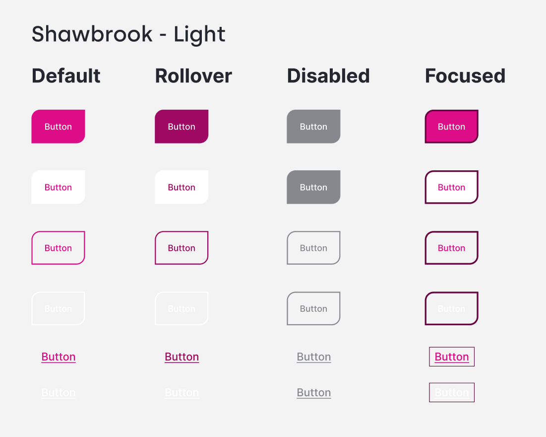
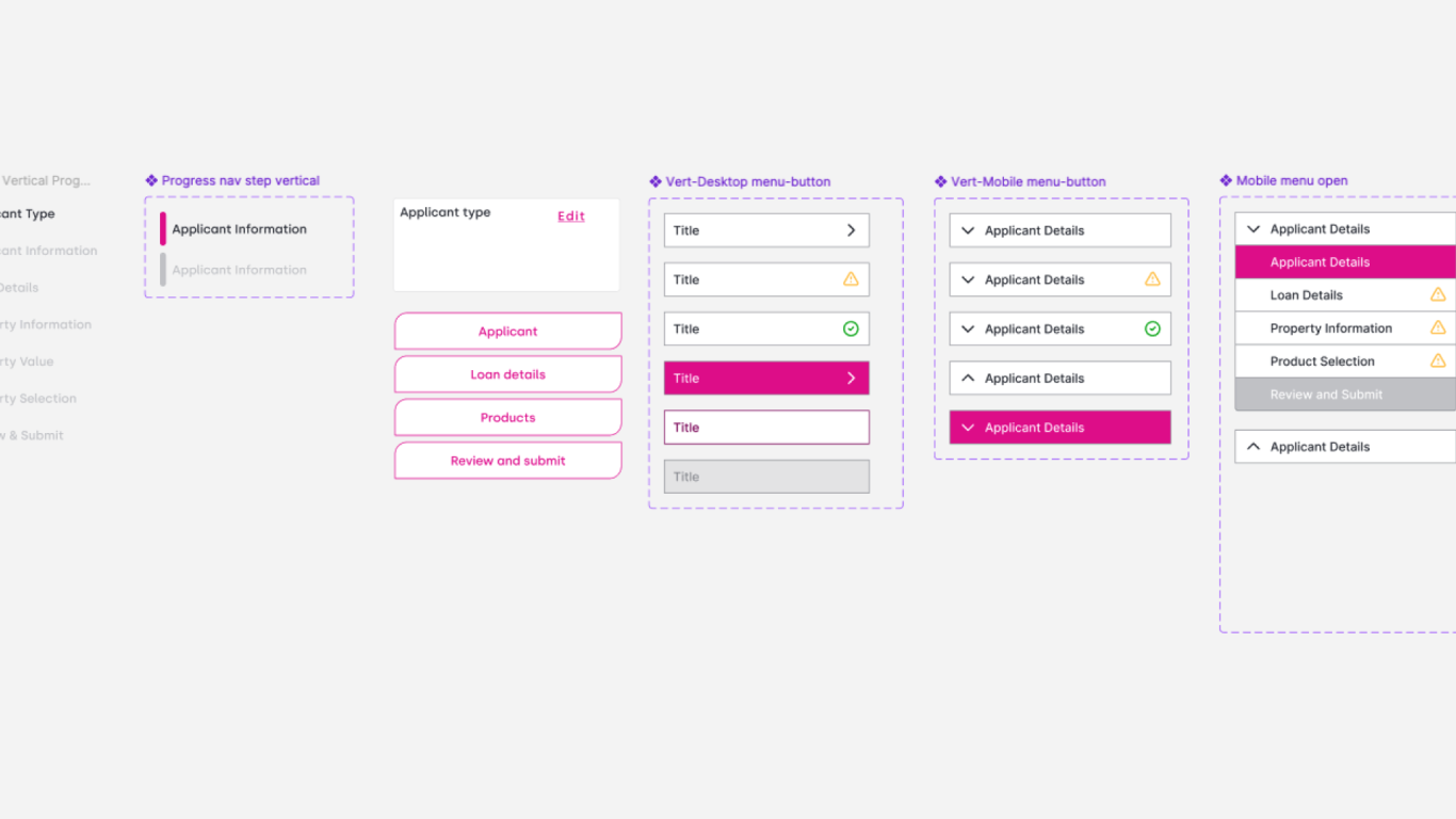
I delivered a 450 item strong component library which included variants and other supporting assets. I also design a style for support documents outlining the best way to use the components.
The library was designed in Figma so was extremely easy to share with other designers and devs, update and scale.
A library was developed for the build-side using 'Storybook' which allowed us to mirror both the design and build environments so whatever was seen in design could be lifted 'off-the-shelf' and used immediately by the engineering team.
This was then 'promoted' on every release from the full system to singular components.
Impact
The SDS is now used across all products produced by Shawbrook.
- The design system saved Shawbrook £450,000 in 2025 in saved design and development time
- Time to market reduced by 45%
- 'Live draw' and fast visualisation massively increased team confidence and stakeholder buy in