
Illustration
Finding stock images is hard and expensive
Selecting the right photography for a given context can be challenging, particularly when the imagery needs to clearly convey a specific message. This complexity increases when brand values and audience relevance must also be reflected, making the use of stock photography both time-consuming and costly.
While icons are available as an alternative, they often lack the level of detail required and can become lost within more complex page layouts.
This raises an important question:
What other visual approaches can be used to communicate clearly, provide sufficient context, and guide users effectively through the experience?
Project overview
Illustration is increasingly being used across industry as a powerful tool for conveying standards and brand values. It allows organisations to communicate complex ideas clearly and consistently, while creating a distinctive visual language that feels more human and approachable than photography alone. When used effectively, illustration reinforces brand identity, improves clarity, and helps guide users through experiences in a way that is both engaging and instantly recognisable.
Research
To understand which illustration style is most effective, a combination of qualitative, quantitative, and comparative research is required. This begins with brand-led research, reviewing existing brand values, tone of voice, and visual guidelines to ensure any illustrative style feels authentic and aligned with the organisation’s identity.
User research is essential to assess how different illustration styles are perceived by the target audience. This may include interviews, surveys, and usability testing to understand clarity, emotional response, inclusivity, and how well illustrations support comprehension.
Benchmarking plays a key role in identifying best practice across the industry. Analysing how leading and adjacent brands use illustration helps highlight effective patterns, common pitfalls, and opportunities for differentiation. This includes reviewing style, complexity, colour usage, accessibility, and consistency across touch points.
Accessibility and usability testing should also be carried out to ensure illustrations support understanding for all users, including those with visual or cognitive impairments.
Finally, iterative testing and validation through prototypes and real-world use allows styles to be refined over time, ensuring they scale effectively, remain flexible across use cases, and continue to reinforce both brand standards and user needs.
Key focus areas
Creating highly creative visual content that sits comfortably within a professional context can be challenging, particularly for organisations that need to convey credibility and seriousness. Striking the right balance between creativity and professionalism is essential to ensure the message remains clear, trustworthy, and aligned with brand expectations.
Consistency with brand
Ensure that the brand is strongly championed and carries a strong brand message.
Ease of generation
We want the design to be easy to generate so we can create illustrations quickly and easily.
Unique style
The style needs to be something that feels like part of the brand and indicative of the organisation.
My role
As I was the principle illustrator on this project, all research, benchmarking and all information on how the illustration is implemented and when it can be implemented.
Problem
The problem to be solved
Complex messages are difficult to communicate clearly
Professional and technical concepts can be hard to explain using text or photography alone, leading to misunderstanding or cognitive overload.
Visual consistency is hard to maintain at scale
Relying on photography or ad-hoc visuals often results in inconsistency, making it difficult to reinforce brand standards across products and touchpoints.
Professional content can feel cold or unapproachable
Serious or functional experiences risk disengagement when they lack warmth or human connection, reducing clarity and trust.
Representation and inclusivity are limited
Photography can unintentionally exclude audiences or rely on narrow representations that do not reflect diverse users and contexts.
Visual assets do not scale efficiently
Creating and maintaining bespoke imagery is time-consuming and costly, particularly as products, features, and use cases expand.
Guidance and storytelling are inconsistent
Users may struggle to understand intent, next steps, or context when visual cues are unclear or vary across experiences.
Why it matters
Being able to effectively help the customer complete a critical task is absolutely critical.
Approach
Define the purpose
Start by understanding what problem the illustration is solving. Clarify the message it needs to convey, the action it should encourage, and the context in which it will be used (product UI, marketing, onboarding, documentation, etc.).
Align with brand and standards
Review brand values, tone of voice, and existing visual guidelines. Establish how illustration should express professionalism, warmth, or authority while remaining consistent with the wider brand system.
Understand the audience
Identify who the illustration is for and how they will interact with it. Consider user needs, cultural context, accessibility requirements, and the level of complexity appropriate for the audience.
Benchmark and explore
Analyse how comparable organisations and industry leaders use illustration. Identify effective patterns, common styles, and gaps where differentiation is possible. Use this insight to inform direction rather than replicate existing solutions.
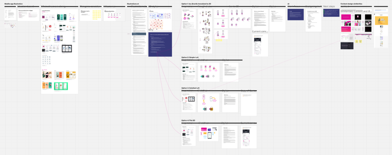
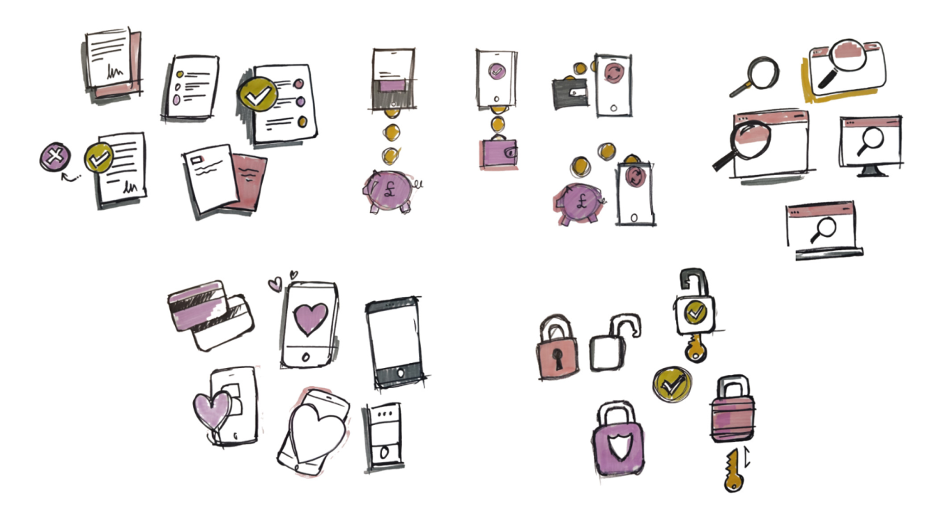
Define the illustration style
Establish clear principles for line weight, colour usage, detail, perspective, motion (if applicable), and tone. This ensures illustrations are recognisable, flexible, and scalable across use cases. All designs are generated in Figma.
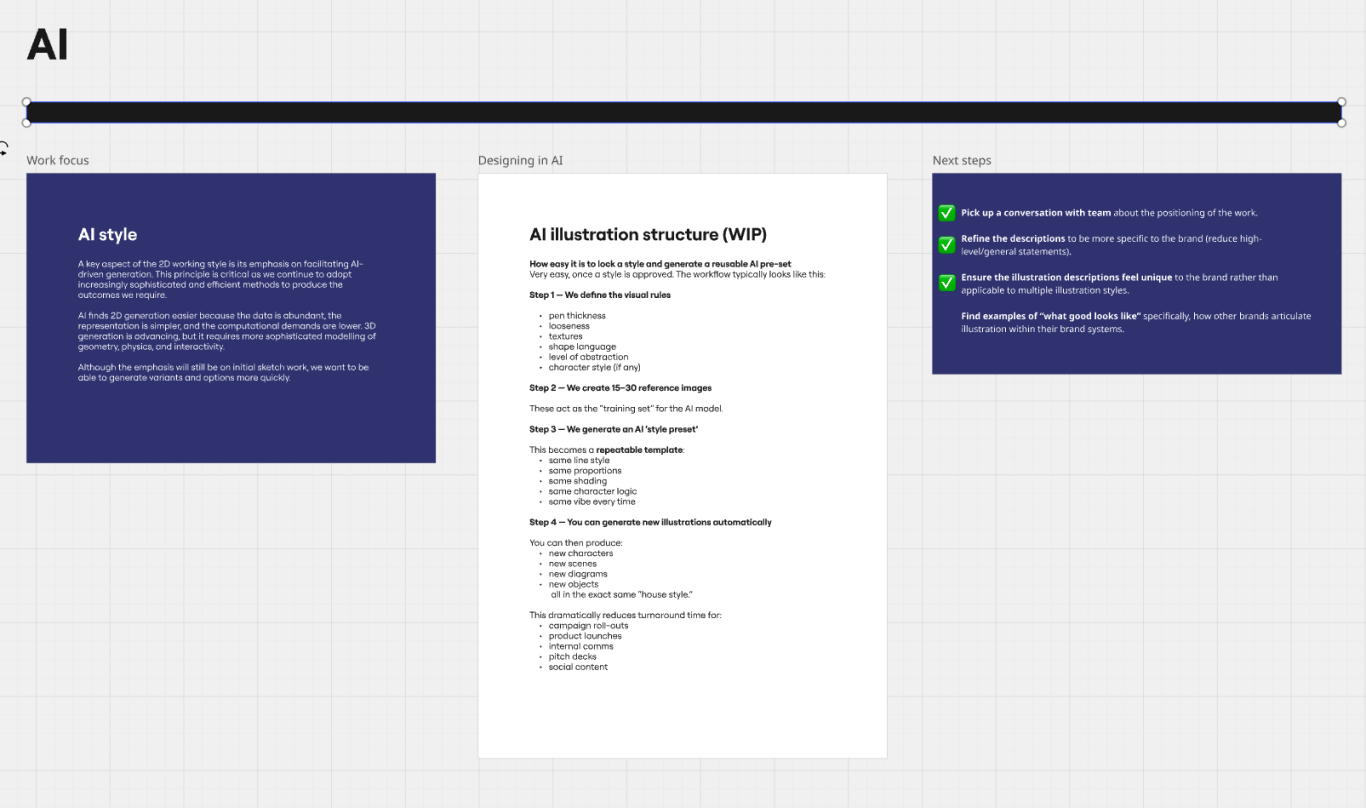
AI creation
Once the illustration style was defined, I developed a structured prompt and agent to codify the visual principles. The AI model was then trained using a curated set of 15 reference images, enabling it to consistently understand and reproduce the established standard of quality and style.
Prototype and test
Create sample illustrations and test them in real contexts. Validate whether they improve understanding, guide users effectively, and feel appropriate within professional environments.
Iterate and refine
Use feedback from users and stakeholders to refine the style and execution. Ensure the illustrations remain clear, purposeful, and adaptable as requirements evolve.
Systemise and scale
Document the illustration approach within a design system or guidelines. Define usage rules, do’s and don’ts, and reusable assets to support consistent adoption across teams.
Solution
A clear style that works on 2x levels, high level as a full composition and a low level that can work as small as 24px. Each illustration is generated when needed so is very reflexive but is also easy to generate.

Impact
We now have a strategy that allows a strong middle ground between icons and stock photography. By having something that we can easily generate to fit any situation.
- Any team member can create an illustration for prototyping (Production level visuals need strong peer review).
- Journeys can now have cohesive visual support at any level.
- A new visual language has been created to compliment design systems.